
App of the Week: Cartogra-fun! (part 1)
Exploring the distortions inherent in map projections

Previously I included an “App of the Week” feature in my Tuesday Substack posts to showcase apps I built with AI assistance. Most of those were small experiments or simple games, designed mainly to demonstrate the surprising range of things that can now be created with modern AI tools. Going forward, I want to highlight something more ambitious: full-featured, commercial-grade applications built through AI-assisted development. To do that, I’m launching a dedicated Thursday series where I’ll present these projects, each in two parts.
This week I’m featuring Cartogra-fun!, an app for learning about and exploring different ways mapmakers have depicted the Earth. It’s a mathematical fact (Gauss’ Theorema Egregium) that a perfect map does not exist: some maps distort areas, some distort lengths, and some distort angles. Each map projection invented by cartographers was created as a compromise between these distortions.
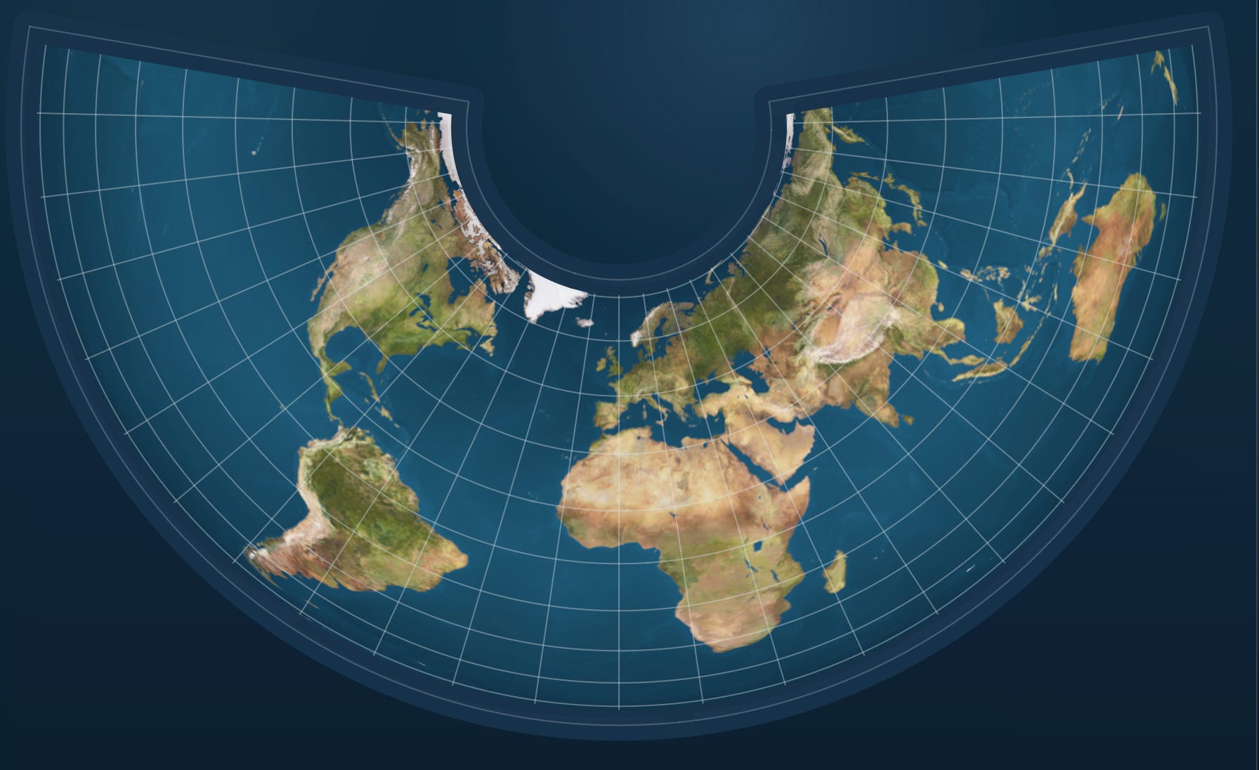
Cartogra-fun! features nine different maps, organized into three categories according to type of projection. I’ll get into the geometry of these projections next week. Today I want to demonstrate how the app helps you understand the inherent distortions in each map. For each projection, you can click on points on the globe and get a visualization of how it distorts a circle of the same size, as shown in the clip below. (Not shown: you can also click on points on the map and get a sense of how circles of the same size on the map represent very different shapes on the Earth.)
Another way to see the inherent distortions is to depict the shortest path between two points on the globe (i.e., a geodesic). On different maps this can be very striking:
Finally, one can get a good feel for each of these maps by looking at the boundary between where the sun is shining and where it isn’t. The app lets you see what that looks like for any given date and time, or you can click “now” to see what it looks like at that moment.
You can play with Cartogra-fun! here. Next week I’ll continue with this app and show you the features that were designed to help you understand the way all of these maps were created (spoiler: Use Geometry!).
David Bachman is a professor of Mathematics, Data Science, and Computer Science. He writes about AI and its real-world impacts. To learn more about his academic work, mathematical art, or AI speaking, consulting, and curriculum development, visit davidbachmandesign.com.